



Visual Merchandising Layout: A UK Guide for 2026
A beautiful shop isn't automatically a productive shop. A carefully styled mannequin, a full rail and a polished colour story can still create friction if customers can't orient themselves, move comfortably or handle the product. The most common mistake I see in UK retail is dense stock at the entrance, where the store should be helping people understand the space.
A strong visual merchandising layout works more like a commercial system than a styling exercise. It gives each fixture a job, creates a deliberate route, makes products easy to inspect and produces evidence that tells you what to keep, move or remove. The practical test is simple: can a customer see the offer, approach it, understand it and buy it without working too hard?
Why Your Store Layout Is Costing You Sales
The entrance is often treated as valuable selling space, so retailers fill it with rails, baskets, promotional tables and new stock. That instinct is understandable, but it usually sacrifices the first requirement of a shop floor: orientation. Customers need a moment to adjust from the pavement, notice the store's character and identify where the main categories begin. A crowded threshold hides the very products intended to attract attention.
This is why negative space has a commercial role. It isn't wasted floor area when it improves sightlines, makes the first display legible and prevents shoppers from having to maneuver around fixtures before they've understood the offer. A dense entrance may display more units, but it can make fewer products feel accessible.
Practical rule: If the customer has to step around a rail before they can see where to go, the entrance is working as storage rather than merchandising.
Visual merchandising should also be treated as a hypothesis. “Moving the new collection to the front will improve engagement” is testable. “This display feels more premium” may be useful creative judgement, but it isn't enough to justify a permanent floor-plan change. Record what happens to movement, interaction and purchasing after the change.
For a useful grounding in how physical environments influence movement and perception, review this resource on store design for customer experience. It complements the more product-focused work of visual merchandising by treating navigation as part of the customer experience rather than an afterthought.
The entrance deserves less stock and more clarity
A tailor's studio might use one complete suit on a form, a clear service message and an unobstructed view towards consultation space. A fashion boutique might show a single outfit with enough room around it to communicate silhouette, fabric and price. Neither approach tries to expose the entire assortment immediately.
The UK retail context makes this discipline more important. The British Retail Consortium reported that total UK retail sales increased 3.1% year on year in June 2025, compared with a 0.2% decline in June 2024. That figure doesn't prove that one fixture or planogram creates sales, but it confirms that physical retail remains a measurable commercial channel requiring careful management. The BRC's retail sales update provides that wider context.
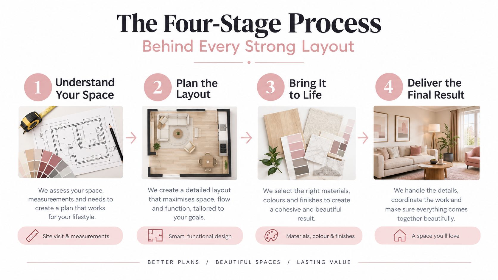
The practical alternative to instinct is a four-stage process: preserve a decompression zone, place the first impact display on the natural right-hand route, organise stock so customers can scan it and reserve feature positions for priority products. The full method matters because a strong focal point cannot rescue a confusing route, and a tidy route cannot compensate for products that are difficult to handle.
For a detailed reference point before redrawing your floor, use Display Guru's guide to retail store layout best practices. Start by removing one entrance fixture, then measure what changes instead of assuming that the floor looks better.
The Four-Stage Process Behind Every Strong Layout
A reliable layout begins with the customer's first few steps, not with the back wall. The following four stages work for a market unit, an independent tailor or a high-street flagship because they separate orientation, attention, navigation and commercial priority.
Start with the decompression zone
Leave the threshold visually calm. Customers are crossing from an external environment with different light, noise and pace, so the first area should help them orient themselves rather than force an immediate product decision. Keep the route visible, remove low baskets that interrupt movement and avoid placing a tall fixture directly in front of the door.
In a children's boutique, this might mean a clear entrance with the main category signage visible beyond it. In a tailoring studio, the threshold could show one finished look and a direct view towards fabric consultation, rather than a crowded collection of forms.
Use the natural right-hand route
UK retail guidance reports that about 90% of shoppers initially turn right and generally browse anticlockwise, while endcaps receive roughly twice the passing traffic of standard aisle positions. Treat these as planning benchmarks, not laws. Creoate's retail industry statistics guidance recommends validating movement with local observation and store-level measures.
Place the first high-impact display on the right, but don't automatically put your most complex story there. A complete outfit, a new-season silhouette or a single hero product gives the customer an immediate visual anchor. The display should invite entry into the route, not block it.
Organise for scanning and handling
Group merchandise horizontally by broad product type, then organise vertically by item, size, colour or variant. A shopper should be able to answer “what is this section?” from a distance and “which version do I need?” at the fixture.
For a dressmaker, horizontal grouping might separate formalwear, daywear and accessories. Within a garment rail, sizes or colour families can run vertically in a consistent sequence. Consistency matters more than a rigid universal formula because customers learn the logic of the particular shop.
Give priority products the strongest feature positions
Use endcaps, feature tables and power walls for products that deserve attention, whether because they're new, strategically important or commercially relevant. Don't waste a high-visibility position on stock that customers can find easily elsewhere.
A complete children's outfit can occupy an endcap, with accessories close enough to create a coherent purchase path. A tailor might use the strongest wall for a seasonal fabric story, then place sample books and service information within comfortable reach.
| Stage | Purpose | Common mistake | Quick check |
|---|---|---|---|
| Decompression zone | Help customers orient themselves | Filling the threshold with stock | Can the customer see into the store? |
| Right-hand focal point | Create the first visual anchor | Blocking the route with a display | Is the product visible before the customer reaches it? |
| Horizontal and vertical organisation | Make categories and variants scannable | Mixing sizes or product types without logic | Can a customer find the relevant variant unaided? |
| Endcaps and feature zones | Give priority products maximum attention | Using premium space for general storage | Does the display have one clear commercial purpose? |
Floor plans are useful, but they're only a starting point. Photograph the shop from the entrance, sketch the main sightlines and mark where fixtures interrupt movement. Retailers who need to visualise a proposed arrangement can also look at Virtual Tour Easy space planning for ideas on translating spatial decisions into a more understandable visual plan.
Once the route is clear, use visual merchandising displays as tools with defined jobs. A mannequin should communicate silhouette, a rail should support browsing and a promotional unit should focus attention. Don't ask one fixture to do all three.
Choosing Fixtures That Carry the Layout
Fixtures determine how much of the product customers can see, how easily they can handle it and how quickly the floor becomes visually dense. The right choice depends less on personal taste than on the behaviour you want to support.
Mannequins and dress forms sell the complete idea. They show proportion, drape, layering and styling in a way a folded garment cannot. In a tailoring studio, an adjustable or pin-friendly form also supports fitting and alteration work. In a shop, a mannequin earns a prominent position when the outfit itself is the message.
Garment rails carry browsing density. They expose more stock than a mannequin and let customers sort, touch, compare and remove items. That makes rails useful deeper in the route or alongside fitting-room access, but a long uninterrupted run can flatten the visual hierarchy. Break it with a lower form, a wall message or a change in orientation.
Dump bins create a gravity point. They work for flexible promotional or lower-priced merchandise, but their height and density can obscure sightlines. Keep them away from narrow approaches, entrances and areas where customers need to read directional signage.
Match the fixture to the customer action
A display form supports looking and imagining. A rail supports searching and handling. A dump bin supports quick selection, but only when the contents remain legible and reachable. That distinction prevents a common mistake, which is choosing a fixture because it holds stock rather than because it supports the intended customer action.
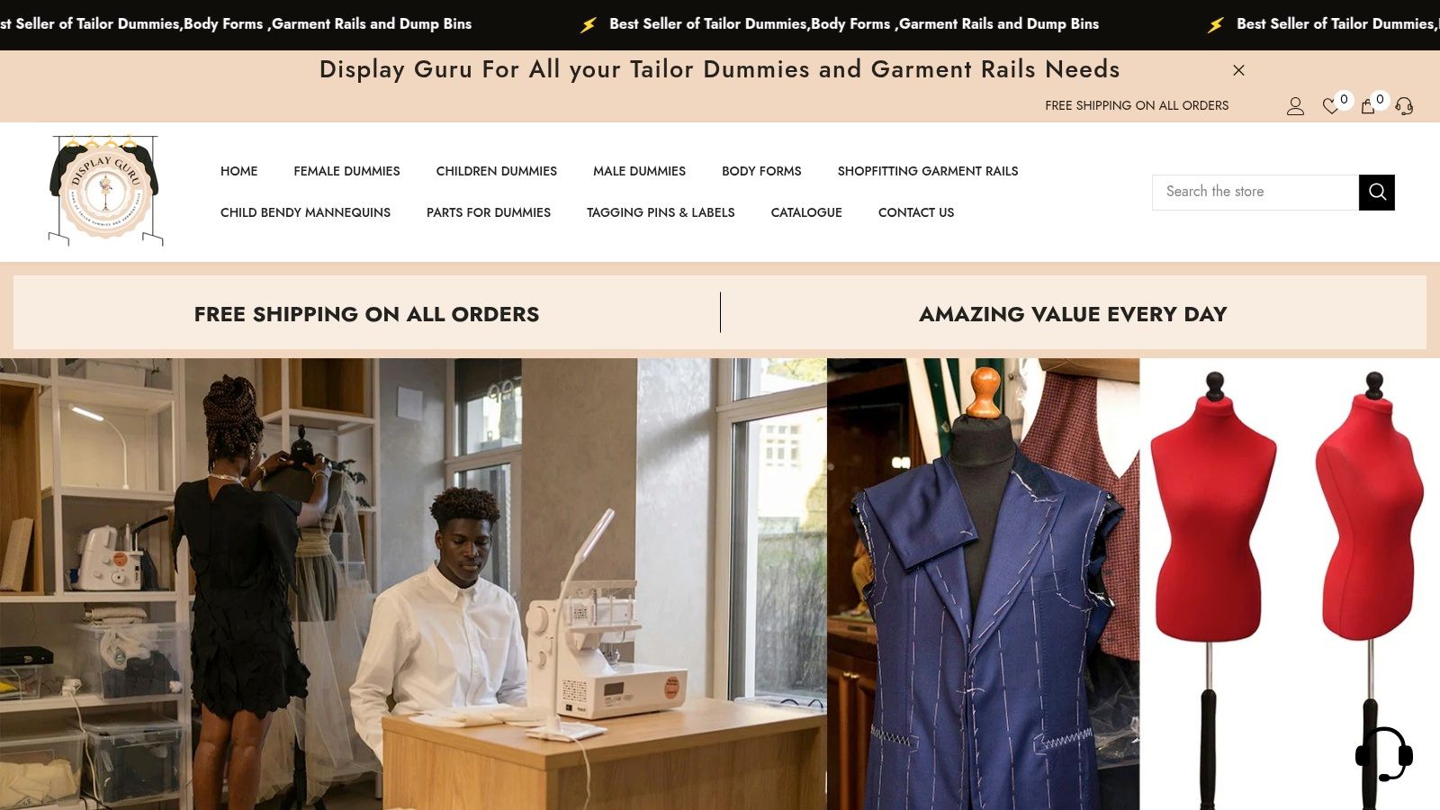
Adjustable mannequins and garment rails from Display Guru are one practical option for retailers, tailors and display teams that need to change silhouette, height or garment presentation without rebuilding the entire floor. The useful feature is flexibility, not decoration. A fixture that can be repositioned makes testing easier.
| Fixture | Best layout role | Sightline impact | Accessibility note |
|---|---|---|---|
| Mannequin or dress form | Hero outfit, window or focal zone | Strong vertical anchor, can obstruct views if grouped tightly | Keep the base outside the circulation route |
| Garment rail | Category browsing and size comparison | Moderate density, may create a visual barrier when overfilled | Leave room for movement and make the rail easy to approach |
| Dump bin | Promotional or flexible feature area | High visual mass, often reduces visibility beyond it | Avoid narrowing walkways or creating hard-to-see edges |
I've found that the most effective fixture mix usually has a deliberate change in height. A tall form catches attention, a rail gives the customer something to browse and a lower display lets the eye travel through the store. Repeating one fixture type across every zone creates consistency, but it can also make the floor feel monotonous and harder to move through.
Use retail display stands when comparing options, but judge every product by its position, reachability and maintenance requirements. Check replenishment access before approving a dense feature, confirm that staff can reset it quickly and make sure the fixture doesn't force customers into a single narrow path.
Reading How Customers Actually Move Through the Space
Paper plans don't show what shoppers do with their hands. A foundational UK case study examined Lush, Disney and Primark stores on Oxford Street through repeated fieldwork during spring 2022. Researchers made three extensive visits to each location and combined mapped floor plans, observational notes, shopper surveys and interviews, recording layout, flow, lighting, scent, behaviour and staff interaction. The full retail spaces case study shows why a layout must support physical evaluation rather than just attractive sightlines.
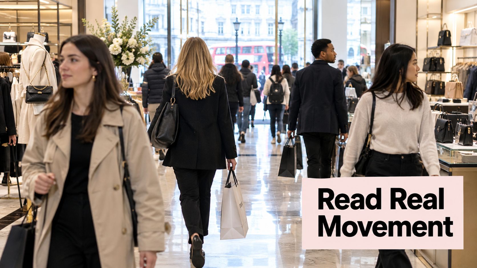
At Primark, customers touched fabrics, unfolded garments and tried items on to assess sizing and design. At Lush, almost every shopper picked up products to test scent, and many used free samples. Those behaviours change the fixture brief. A product that needs handling cannot sit behind a barrier, inside an overfilled bin or on a display labelled by implication as untouchable.
Turn observation into floor decisions
Watch one zone without intervening and record four things: where people stop, what they touch, what they bypass and where they need staff help. Don't interpret immediately. First collect the behaviour, then ask whether the fixture, signage, stock position or access route caused it.
A fashion rail beside a fitting room can turn touch into a conversion moment because the customer can compare fabric, take a garment to try and return to related pieces. A perfume or beauty display needs testers positioned where customers can stop without blocking the route. A costume display may need a clear fitting or consultation area rather than a theatrical arrangement that nobody can approach.
Disney's environment demonstrates a different challenge. Immersive theming can strengthen the experience, but the themed elements still need to coexist with movement, product visibility and transactional flow. The lesson for a smaller retailer isn't to imitate a flagship. It's to ensure that atmosphere supports the customer task rather than competing with it.
Use the video below as a prompt for reviewing movement and display interaction, then compare its ideas with what happens on your own floor.
A “do not touch” display may preserve styling for a while, but it can strip away the sensory evidence customers need before buying. Protect only what requires protection, and create a nearby handling sample when the product itself must remain pristine.
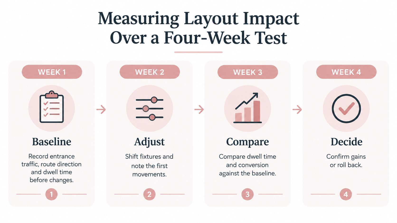
Measuring Layout Impact Over a Four-Week Test
A floor plan can look convincing and still fail in trade. The disciplined alternative is a controlled four-week test that changes one variable while keeping price, assortment and promotional exposure stable. The test doesn't need advanced software. A shop manager can use a printed floor plan, a tally sheet and the till report.
Start with a four-week baseline for entrance traffic, route direction, dwell time, product touches, fitting-room entry, conversion rate and average basket value. Record the same measures by zone where possible. If staff count visitors manually, use consistent time windows and definitions. “Dwell” should mean the same thing on every observation day.
Change one variable
Create a control arrangement that reflects the current floor and a treatment arrangement based on one hypothesis. You might move complementary products together, highlight a hero item or place a complete outfit on a mannequin beside its accessories. Rotate the treatment across comparable trading periods to reduce weekday, weather and promotional bias.
Track the measures that explain performance, not just revenue:
- Conversion rate: transactions divided by identified visitors.
- Sales per square metre: sales divided by selling area.
- Units per transaction: useful when testing cross-merchandising.
- Average transaction value: helpful when a layout aims to support complete outfits.
- Zone dwell time: a signal of attention, but not proof of purchase intent.
- Product interaction: touches, fittings, tests or requests for assistance.
The UK retail guidance cited earlier reports potential improvements of approximately 30% in foot traffic, 18% in dwell time and up to 20% in conversion when positioning, visual cues and shopper flow are planned effectively. These are directional claims, not guaranteed outcomes, so calculate your own result using uplift = (treatment metric − control metric) ÷ control metric. The WBC guidance on branding and signage provides the source context for those directional figures.
Don't treat a higher-revenue display as automatic proof that the layout worked. It may just occupy a busier location. Avoid changing lighting, price, signage and assortment simultaneously, and don't confuse longer dwell with better performance. A layout that increases browsing but obstructs replenishment or accessibility may create operational costs that the till report won't show immediately.
For larger operations comparing customer-flow platforms, an Aislelabs alternative for enterprises may help frame the technology choices. Smaller retailers can still use the same logic with manual counts. Pair the commercial measures with customer satisfaction metrics so navigability and service quality remain part of the decision.
Designing Layouts That Work for Every Shopper
Accessibility isn't a compliance afterthought. It's a layout-performance requirement, because customers can't evaluate or purchase merchandise easily when signage is unreadable, routes are unpredictable or fixtures create hazards.
UK evidence reports that 56% of visually impaired shoppers struggle with small or hard-to-read text, 40% with poor lighting, 23% with frequently changing product placement and 17% with inaccessible layouts. Respondents wanted large, high-contrast print, consistent layouts and trained staff, according to GS1 UK's accessibility evidence. A 2025 University of Hertfordshire study also identifies sensory overload, navigation difficulty and communication barriers as obstacles in physical retail, recommending wider aisles, suitable lighting, clear signage, lowered fixtures and tactile guidance.
Make the route predictable
Keep primary circulation clear and avoid moving core categories without a reason. Use high-contrast signs at readable heights, reduce competing promotional messages and position adjustable rails or forms so their bases don't intrude into the walking line. A lower fixture can preserve sightlines while making products easier to reach.
Sensory considerations matter too. A highly reflective, densely signed display can overwhelm some shoppers even when it appears energetic and commercial. A calmer layout with clear product zones may support both deliberate missions and browsing. Accessible design doesn't require a bland shop. It requires controlled contrast, reach, lighting, texture and movement.
Staff observation should form part of the test. Note where shoppers hesitate, ask for directions or abandon an approach. Invite disabled customers to review the route where possible, and treat their feedback as evidence about the floor rather than as a courtesy exercise.
Colour can support category recognition and contrast when applied carefully. Use retail colour psychology as a design input, but don't rely on colour alone to communicate location or product differences. Pair it with words, symbols, texture and consistent placement.
A One-Week Plan to Put It All Together
A practical reset can begin this week.
- Monday: Clear the entrance and mark a decompression zone on the floor.
- Tuesday: Photograph sightlines from the door, fitting room and till.
- Wednesday: Build one right-hand focal display with a complete product story.
- Thursday: Reorganise one category horizontally and its variants vertically.
- Friday: Check bases, rails, signs and dump bins for route obstruction and reach issues.
- Weekend: Start recording entrance traffic, route direction, dwell time and interactions.
- Next month: Run one four-week test, changing one fixture position or display variable at a time.
A strong visual merchandising layout isn't created by one dramatic redesign. It improves through small, measured moves that make products easier to see, handle, compare and buy.
Display Guru supplies tailor dummies, body forms, garment rails and dump bins for retail displays, tailoring studios, costume work and sewing spaces. Use Display Guru to choose fixtures that support your route, test new presentations and keep the floor adaptable as customer behaviour changes.