



Visual Merchandising Displays: A Complete Guide
UK convenience shoppers spend just 3 minutes 51 seconds in-store and pass roughly 606 product displays, so each fixture receives only about 0.3 seconds of attention on average. Effective visual merchandising displays must therefore communicate their purpose almost instantly, before a shopper has moved on.
That changes how a boutique owner should read the shop floor. A display isn't successful because it contains more stock, more props or more information. It succeeds when a shopper can recognise the product, understand its relevance and see the next action without having to stop and decode the scene.
Visual merchandising is the discipline of making that decision easier. It connects product selection, space planning, lighting, fixtures and customer movement. In the UK, the practice also has a long retail history. Regent Street shops were opening in 1825, while Selfridges opened in London on 15 March 1909 with a £400,000 launch budget and became known for vast plate-glass windows and displays illuminated at night. Those traditions helped establish the shop window as a sales medium rather than a simple place to hold products. Read more about why visual merchandising is important.
Why Visual Merchandising Displays Matter More Than Ever
In convenience retail, shoppers average 3 minutes 51 seconds in-store and pass approximately 606 individual product-category displays. That gives each display only about 0.3 seconds of attention on average, according to UK convenience retail research on shopper attention.

The implication is straightforward. Visual capture comes before persuasion. A display can't explain a product's full story if the shopper hasn't first noticed where the story begins. A crowded table of folded garments, layered signs and decorative objects may look energetic from a distance, yet become visually indistinct when someone is moving through the shop.
Design for recognition before detail
Start each display with one dominant message. It might be a new collection, a complete outfit, a seasonal gift idea or a practical product combination. The shopper should identify that message from the entrance or the main aisle, then discover the supporting details at closer range.
This doesn't mean every display should be empty. It means each item needs a role. A hero product attracts the eye, related products provide context, and a short sign answers a useful question. Anything that doesn't support those jobs should be removed or moved elsewhere.
A UK study found that adding theatrical elements, such as character graphics or seasonal accompaniments, doubled conversion compared with a plain stack of products. The lesson isn't to add props indiscriminately. It is to use relevant theatre to make the display easier to understand and more memorable.
Practical rule: If a shopper needs to read every sign before understanding the display, the display is carrying too much information.
More merchandise isn't automatically stronger
Retailers often fear empty space because every unused surface appears to represent missed selling opportunity. In practice, purposeful negative space can separate products, clarify hierarchy and make a focal item easier to notice.
This is especially important for small boutiques. A lower-volume arrangement can make a collection feel considered, help customers move between categories and simplify replenishment. Current UK retail display coverage also points towards modular, reconfigurable systems, lightweight structures and temporary installations that can change for seasonal moments or activations while reducing the burden of one-off builds. Recent UK coverage of flexible display systems highlights why operational flexibility now matters alongside appearance.
Read the space as a fast-moving sequence rather than a static picture. Ask what a shopper sees first, what they understand next and where they can comfortably reach the product. The best display is often the one that removes a decision barrier without adding another object.
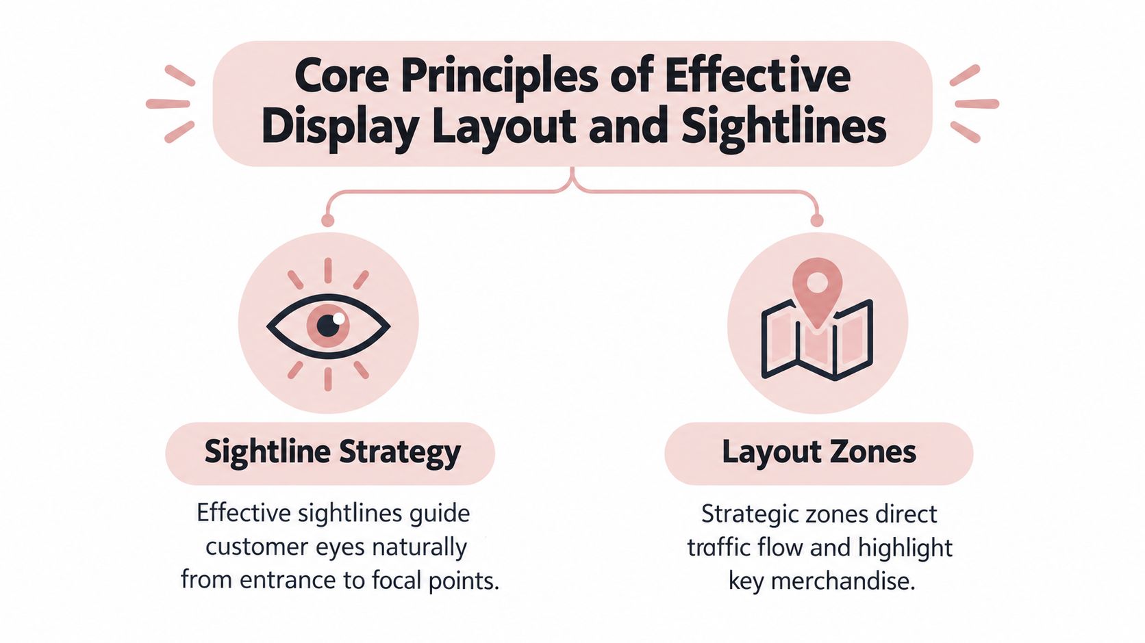
Core Principles of Effective Display Layout and Sightlines
Design for the first 0.3-second attention window. A shopper entering a UK shop may register a display before consciously deciding where to look, so begin with the eyes rather than the furniture. Stand at the entrance and trace the natural sightline towards the first wall, feature table or open aisle. That opening view needs one clear focal point, not several messages competing at the same volume.
Build a route with visual anchors
Map the shop as a sequence of decisions:
- Entrance view: Identify the first product group visible as customers cross the threshold.
- Primary focal point: Place the item or collection that deserves immediate attention within that sightline.
- Movement cue: Use a table, rail, colour block or sign to suggest the next zone.
- Discovery area: Leave enough room to browse, touch and compare without interrupting circulation.
- Decision point: Position complementary products or useful information where shoppers are likely to pause.
This sequence relates to the golden triangle, a practical way to assess the connection between the entrance, the main focal display and the route through the shop. Treat it as a diagnostic tool rather than a fixed formula. Its value is simple: it reveals whether priority merchandise sits where customers' eyes and feet naturally travel.
End-of-aisle displays, free-standing display units and shelf-edge signage are among the display types UK shoppers frequently encounter. Analysts at POPAI found that about 39% of shoppers immediately noticed a gondola end or bulk stack on entering a store, while discounters used these prominent positions in 97% of cases. POPAI's UK in-store display research shows why fixture position can influence attention as much as the merchandise itself.
Use zones instead of filling every gap
Give each part of the floor a job. The entrance should orientate customers. The central area can support exploration or outfit building. A quieter perimeter may suit products that need comparison, fitting activity or slower browsing.
Keep high-margin or strategically important products within comfortable eye and hand range where appropriate, while protecting the view across the shop. A tall display beside the door can block orientation and make a small space feel tighter. A lower feature table can identify a category while keeping the next area visible.
For practical guidance on planning the physical environment, see these retail store layout best practices, then adapt the principle to your own customer route. Trail Star Development retail ideas can also provide planning inspiration, but the result should fit your stock, floor area and operating routine.
Modular layouts make this testing more realistic. A lightweight table, rail or sign that can be repositioned lets a retailer respond to seasonal ranges, campaigns and changing traffic without rebuilding the shop. Flexibility becomes part of the layout strategy, not an afterthought.
The most persuasive route feels natural. Customers should discover the next category without feeling pushed through the shop.
Test the arrangement from the doorway, till and end of each main aisle. If a key product vanishes behind a fixture, or a sign competes with the focal display, adjust the sightline before changing the merchandise.
Choosing the Right Display Fixtures for Your Space
Fixtures are working tools, not decoration. Each one changes how customers see, approach and handle merchandise, so choose it according to the behaviour you want to encourage.
A mannequin or tailor dummy creates a complete visual proposition. It shows proportion, styling and context in a way that a folded garment can't. Use one when the product needs to be imagined on a person, such as a coordinated outfit, a formal garment or a collection with a strong silhouette.
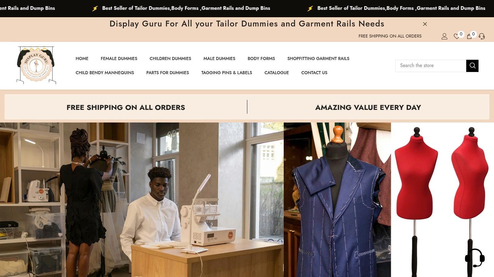
A mannequin works best when the styling remains legible. Avoid covering the form with competing accessories or positioning it where passing customers can only see its side. Give the outfit enough surrounding space to read as a complete idea.
Match the fixture to the customer's task
| Fixture | Strongest role | Watch for |
|---|---|---|
| Mannequin or body form | Showing aspiration, fit and a complete look | Overstyling that distracts from the garment |
| Dump bin | Encouraging tactile browsing and grouped purchases | Untidy stock that makes selection difficult |
| Garment rail | Supporting self-service browsing and comparison | Overcrowding that hides individual pieces |
A dump bin suits products that benefit from touch, rummaging or a sense of abundance. It can work for accessories, smaller packaged items, fabric remnants or promotional merchandise. Keep the contents organised enough for shoppers to understand the category quickly. A dump bin that becomes a disordered container communicates low value even when the products themselves deserve attention.
A garment rail supports a different behaviour. It gives customers a clear, self-directed way to browse, compare sizes and move along a collection. Use rails to create a linear story, separate categories or form a gentle boundary between zones. Leave enough space for garments to move easily, and avoid placing the rail across the main route.
Layer fixtures without creating obstacles
A boutique might place a mannequin near the entrance to communicate the season, a rail behind it for the full collection and a small dump bin nearby for complementary accessories. The arrangement creates layers, but each fixture still has a distinct job.
A shop with limited floor space may achieve the same effect with a wall-mounted rail, one body form and a compact accessory unit. The decision should follow product depth, customer movement, stock replenishment and accessibility rather than a desire to include every fixture type.
For a broader look at display equipment and merchandising applications, retail merchandising stands from Display Guru provides relevant product context.
The video below can help you think about the relationship between garment presentation and form:
After installation, walk the customer route with a basket or coat in hand. A display that looks elegant but narrows the aisle, catches sleeves or makes a product hard to reach needs a practical adjustment.
Lighting and Seasonal Tactics That Drive Engagement
Lighting should direct attention, preserve colour accuracy and support the mood of the shop. Start by checking the ambient light across the entire space. A hero product may need stronger directional light, while an overlit background can flatten the contrast and make the focal point disappear.
Use warmer light to support an intimate, tactile atmosphere and cleaner light where accurate colour or detail matters. The right choice depends on the merchandise, the brand and the existing fittings. Avoid aiming a bright beam directly at reflective packaging or glossy fabric, because glare can make the product harder to inspect.
Create seasonal change with a repeatable system
Seasonal displays work best when they refresh the customer experience without forcing a complete rebuild. Keep the core fixtures stable, then rotate a small group of elements:
- Colour: Introduce a controlled seasonal palette through signage, backdrops or selected props.
- Texture: Use fabric, foliage, paper or natural materials to give the display a tactile cue.
- Product edit: Feature a deliberate selection rather than placing every seasonal item in one scene.
- Lighting focus: Move the brightest emphasis to the seasonal hero product.
- Signage: State the useful idea clearly, such as gifting, layering or event dressing.

Props should explain the product world, not compete with it. A few autumn references can support a clothing story, while an excessive arrangement of pumpkins, leaves and signs can obscure the merchandise and make the window read as decoration rather than retail.
Plan the changeover before you build
Create a small kit of reusable components with consistent attachment points and storage labels. Lightweight panels, interchangeable graphics and adjustable supports make it easier to refresh the window without discarding a complete construction.
This approach also suits temporary events and promotional moments. Retailers planning a pop-up or brand experience may find guidance on designing brand activations for events useful when considering how the display should function during setup, live engagement and removal.
Before opening, check the display in daylight and under evening illumination. Then stand outside and view it at walking distance. If the seasonal theme is visible but the product isn't, reduce the props or redirect the lighting.
Measuring Display Performance with Practical KPIs
A display deserves a measurement plan before it receives a permanent position. Without one, a retailer may mistake personal taste for performance or keep a visually attractive arrangement that doesn't help customers choose.
Begin with a simple baseline for the product group. Record sales, stock availability and the display position before making a change. Then compare the same measures after the display has had enough time to generate meaningful customer interaction, while noting external factors such as promotions, weather, staffing and delivery timing.
Track behaviour and commercial outcomes together
Useful KPIs include:
- Display conversion: Compare the number of shoppers who interact with a display with the number who purchase from its product group.
- Dwell time: Observe whether customers pause, browse and handle products, rather than just passing the fixture.
- Average transaction value: Check whether the display supports complementary purchases or larger baskets.
- Sell-through by position: Compare how quickly similar products move from a feature area, rail, shelf or dump bin.
- Stock availability: Separate weak presentation from an empty fixture or missing size range.
- Return and feedback patterns: Look for signs that the display creates interest but doesn't provide enough product information.
These measures work best as a set. A display may attract attention but produce limited sales because the price is unclear, the product is difficult to reach or the available sizes don't match demand. Conversely, a quiet-looking display may support strong sales because existing customers already know what they want.
Turn observation into a test
Change one meaningful variable at a time. Move a rail to a stronger sightline, simplify the sign, replace a crowded dump bin or adjust the lighting on the hero product. Keep a short record of what changed and why, then compare the results with the previous arrangement.
For digital touchpoints, BonusQR's explanation of tracking customer engagement provides useful context for connecting interactions with measurable actions. A physical display can use the same principle through a product-specific QR code, event sign-up or offer code, provided the action is relevant and easy to complete.
For wider customer experience measurement, see customer satisfaction metrics from Display Guru. The aim isn't to reduce visual merchandising to a spreadsheet. Data helps you decide which creative choices deserve more space, which need refinement and which should be retired.
Inspirational Visual Merchandising Examples and Applications
A useful display example doesn't need to be copied exactly. It should show how a retailer connects a fixture to a customer task.
Consider a small fashion boutique with a narrow front window. Instead of placing a dense selection of garments across the glass, the owner uses one styled form, a restrained background and a rail positioned just inside the entrance. The form communicates the complete look from the street. The rail gives an interested shopper immediate access to the collection without turning the window into a storage area.
A second example involves a fabric or sewing shop. A body form presents a finished garment, while nearby rails show related fabrics or trims and a compact bin holds smaller complementary items. The form creates aspiration, the rail supports comparison and the bin encourages tactile discovery. Each fixture answers a different question, so the display remains useful rather than merely decorative.
Build scenes around customer missions
Cross-merchandising becomes more effective when it reflects a real reason to buy. A boutique might group a dress with a jacket and accessory that complete an occasion outfit. A home sewing studio could show a finished garment beside the form, fabric options on a rail and tools or notions in a small grouped unit.
Keep the sequence visible from the main route. The hero item should lead, the supporting products should sit close enough to be understood as a group, and the price or next step should be easy to find. If customers need to search across the shop for the components, the visual story breaks.
A flexible arrangement also helps retailers respond to changing stock. Adjustable rails can be reconfigured as collections change, while body forms can move between a window and an interior feature. Dump bins can support a seasonal edit, then return to a different category when the promotion ends. This is the operational value of modular merchandising. It lets the team refresh the shop without rebuilding every element from scratch.
Translate the idea into your own space
Use window display ideas from Display Guru as a prompt, then audit the proposal against your own entrance, product range and replenishment routine. A display that works in a spacious department store may obstruct a compact boutique, while a modest arrangement can be highly effective when its sightline and message are clear.
Before installing anything, sketch the customer route, mark the first focal point and identify the product that should be easiest to understand. Photograph the display from outside, from the entrance and from the till. Review those views with the same question each time: can a shopper see what the display is offering before they have to stop?
Display Guru offers tailor dummies, body forms, garment rails and dump bins for retail displays, sewing work and creative presentation. Visit Display Guru to choose fixtures that support clearer sightlines, flexible seasonal changes and more practical product organisation.