

Visual Merchandising Fashion That Turns Browsers Into Buyers
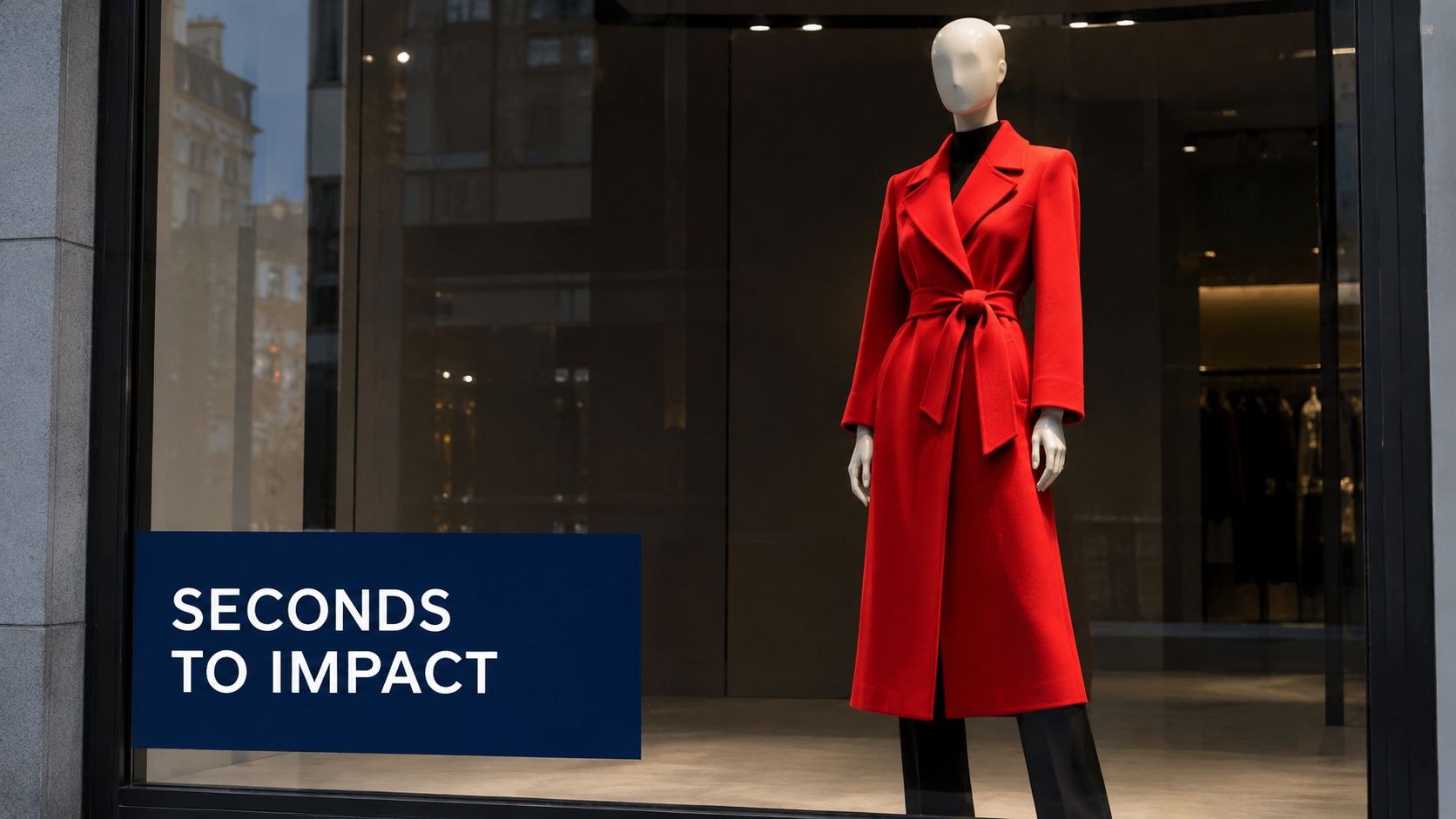
You're standing outside a fashion shop while a customer slows beside the window. The clothes are attractive, but the display feels crowded, the lighting is flat, and there's no obvious reason to step inside. A few doors later, another retailer has built a clear outfit story around one striking coat. The passer-by stops, understands the look almost instantly, and enters.
That difference is visual merchandising fashion as a conversion system. The window earns attention, the entrance confirms the promise, the layout guides movement, and the product presentation removes uncertainty. A beautiful display matters, but it must also help shoppers find, understand, imagine and buy the right products.
This guide approaches the subject as a senior visual merchandiser would train a new store manager. You'll start with attention and shopper intent, then move through layout, fixtures, styling, lighting, seasonal campaigns, measurement and sustainable choices. If you're also improving your digital customer journey, a practical ecommerce sales playbook 2026 can help you connect the shop-floor experience with online conversion. For the wider commercial role of presentation, this overview of why visual merchandising is important provides useful context.
Why Visual Merchandising Decides Fashion Sales in Seconds
A passer-by doesn't study your window like a catalogue. They glance while walking, register a colour or silhouette, and decide whether the shop looks relevant to them. That decision happens before they've touched a garment, read a price ticket or spoken with a member of staff.
Your display therefore has a short commercial job. It must communicate what kind of fashion you sell, who it suits and why the current offer deserves attention. A boutique selling relaxed linen should create a different first impression from a formalwear specialist, even if both use mannequins and rails.
A strong window works like a book cover. It doesn't explain every chapter. It creates enough clarity and interest for the reader to open the book.
The first impression must have a job
Store managers often ask whether a window looks premium, seasonal or creative. Those questions matter, but they're incomplete. Ask instead:
- What should the shopper notice first? Usually this is a hero garment, a colour group or a complete outfit.
- What should they understand next? The display should make the product category, price position or styling idea legible.
- What action should follow? The customer might enter, look for a matching piece or ask about availability.
A window with five competing focal points gives the passer-by no clear route through the story. Reduce the number of visual messages, increase the strength of the main one, and let the product carry the commercial meaning.
Small shops can compete through clarity
Independent retailers rarely have the same floor area or production budget as a national chain. They can still create a stronger experience by editing harder. One coherent outfit, a disciplined colour palette and a well-positioned light source often communicate more effectively than a large collection of unrelated products.
The same principle applies inside. If the customer enters and immediately sees a confusing wall of stock, the promise made by the window disappears. The window earns the visit, but the first interior sightline earns the next few minutes.
Practical rule: Every display element should either attract attention, explain the product or guide the next action. If it does none of these, remove it.
What Visual Merchandising Means in Fashion Retail Today
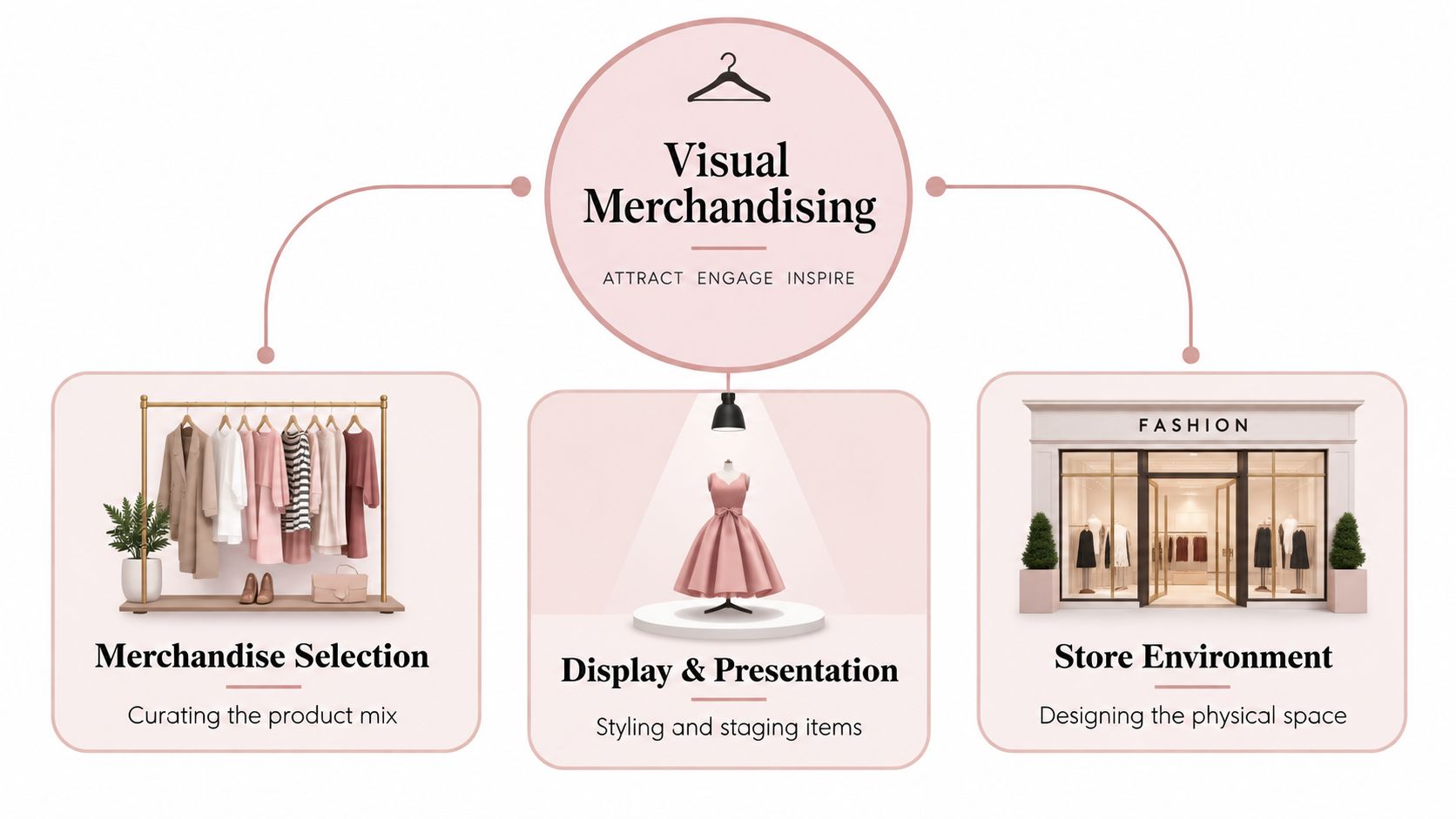
Visual merchandising is the planned combination of merchandise selection, product presentation and store environment. In fashion retail, that means choosing which garments deserve emphasis, styling them in a persuasive way and arranging the physical space so customers can move from first impression to purchase.
The definition becomes easier if you think of the shop as a stage. The clothing is the cast, mannequins are the performers, lighting sets the mood, fixtures create the scenery and the customer becomes part of the scene. A stage can contain excellent actors and still fail if the audience can't see the action. Your store works in the same way.
Start with the product mix
Merchandise selection comes first because presentation can't rescue an incoherent offer. Decide which products represent the current commercial message, which items complete the look and which stock needs visibility because it's new, seasonal or strategically important.
That doesn't mean hiding the rest of the range. It means giving the customer an understandable entry point. A rail organised around a complete occasion, such as workwear or weekend dressing, helps shoppers interpret separate garments as usable solutions.
Turn presentation into a brand language
Display and presentation include mannequin styling, folding, hanging, spacing, signage, props and fixture height. These choices should repeat the brand's character. A minimalist luxury retailer may favour restraint and generous negative space, while a youthful streetwear shop might use stronger grouping, layered graphics and active poses.
The environment completes the message. Store design, flooring, wall finishes, music, mirrors, fitting rooms and lighting all influence whether the customer experiences the brand as relaxed, technical, romantic or directional.
UK fashion retail's professionalisation of visual merchandising became especially significant in the late 1990s. A 1998 UK fashion marketing paper described the renaming of display as visual merchandising as a move that centralised and professionalised the function, making it a recognised specialist discipline rather than a purely decorative task. The paper also linked merchandise selection, display, store design and layout with attracting customers and bringing the fashion experience to life. The historical discussion is available through Emerald Publishing.
For a manager, the practical test is simple: if you changed the logo but kept the display, would customers still recognise the brand? If not, the visual language needs more consistency.
How Store Layout and Traffic Flow Guide Every Shopper
A store layout is a silent sales assistant. It can invite a customer towards a new collection, create a natural pause beside a complete outfit or leave valuable stock invisible in a dead corner. The best layouts don't force movement. They make the next useful destination feel obvious.
Begin with the entrance and sightline
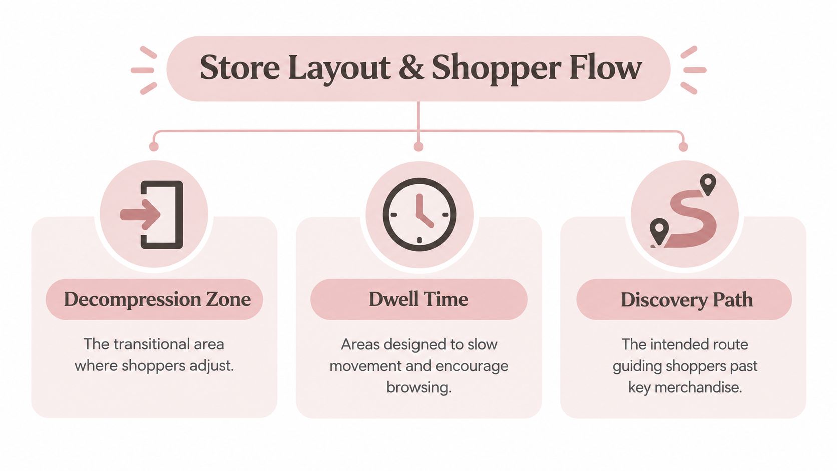
The area immediately inside the entrance is a transition space. Customers are adjusting from the pavement, checking the environment and orientating themselves. If you place dense promotional messaging or a large fixture directly in front of them, they may miss the first product story.
Stand outside the shop and record what a customer sees through the glass and doorway. Then stand just inside the entrance and note the first clear sightline. That point is a candidate for a hero wall, campaign table or complete mannequin look.
Use the route as a sequence:
- Entry and orientation: Keep the first view clear enough for the shopper to understand the store.
- First focal point: Present the strongest current message where it can be seen without obstruction.
- Category discovery: Place related products close enough to support outfit building.
- Dwell areas: Use mirrors, fitting rooms, seating or tactile fixtures to encourage consideration.
- Till approach: Put relevant add-on pieces where customers naturally slow down, without creating clutter.
Match density to shopper mission
A browsing customer needs discovery. They can tolerate more visual variety if the store provides a clear hierarchy. A shopper buying a gift or searching for a specific occasion needs faster orientation, stronger category cues and fewer competing focal points.
A UK convenience-retail eye-tracking study examined 424,000 point-of-purchase interactions and found that character graphics or seasonal accompaniments produced roughly twice the conversion rate of a plain stack of products in the relevant retail setting. The lesson for fashion isn't that every store should copy convenience displays. It's that theatre and context can help a shopper understand why a product matters, while simple massing alone may not provide enough meaning. The study is discussed by Convenience Store.
Test the floor plan without rebuilding
Move temporary rails, tables or boxes into alternative positions before committing to new fixtures. Walk the planned route as a customer, then as a staff member carrying folded stock. Check whether fixtures block sightlines, whether categories are easy to locate and whether customers naturally pass the products you want them to discover.
A useful layout is a guided path, not a maze. Give customers reasons to move deeper into the store, but preserve enough openness for them to choose their own pace.
For further practical guidance, compare your plan with these retail store layout best practices.
Mannequins Fixtures and Props That Tell a Fashion Story
A mannequin doesn't sell an outfit by existing in the window. It sells when the pose, styling and surrounding products help the customer understand how the clothing behaves in real life. The fixture should make the garment easier to imagine, not compete with it.
British fashion display has long used physical forms to create movement and aspiration. In the mid-1930s, J. Gottwald Ltd. began producing “sporting mannequins” in active poses, making the mannequin itself part of the story. By the early 1950s, abstract windows were giving way to elaborate scenes, including palace ballrooms and fairytale settings. During the post-war austerity period, severe stock shortages also pushed London retailers to rely more heavily on display to maintain fashionable appeal. The history of these developments is examined by Business History.
Build outfits before you build scenes
Start with the garment. Style one complete look, then add only the pieces that improve interpretation. A jacket may need the right trouser shape, shoe direction or bag to communicate its intended use. Don't add props just because the display feels empty.
Use height and pose to create rhythm. A seated form can suggest ease, an active pose can support sportswear and a straight, balanced stance can reinforce tailoring. Group mannequins so the customer's eye travels between them, but leave enough space for each silhouette to remain readable.
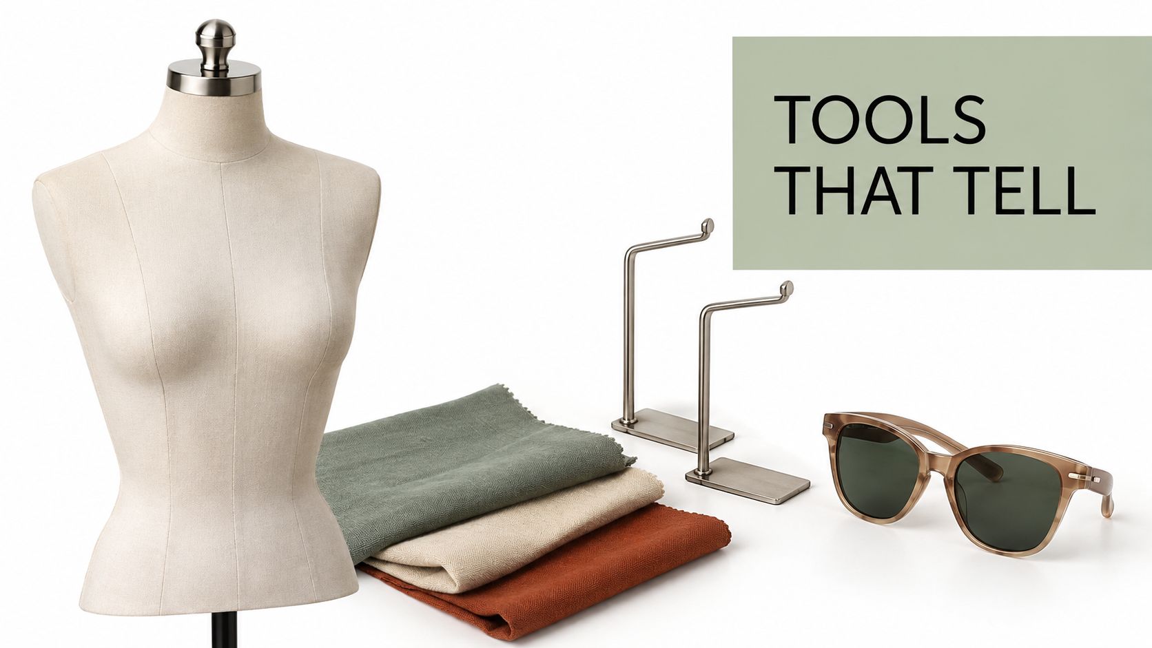
Tailor dummies and body forms serve a different purpose. They show construction, fit and fabric handling particularly well, making them useful for dressmaking, atelier-led collections and garments that need close inspection. Rails carry depth and size availability, while modular fixtures help you change the story as stock moves.
Read this guide to choosing mannequins for shops before selecting forms for a new floor plan.
Let fixtures support flexibility
A garment rail should make browsing easy, not turn the shop into a warehouse. Keep related pieces together, use consistent hanger direction and avoid overfilling the rail so customers can separate garments without wrestling with them. A dump bin can support folded accessories or promotional stock, but it needs clear organisation and regular recovery.
Display Guru supplies tailor dummies, body forms, garment rails and dump bins for retail, sewing and display work. Its adjustable and pin-friendly polystyrene forms are available in a range of sizes, with tripod or round-base stands, so a manager can select equipment according to garment type and presentation needs.
The following video offers another visual reference for constructing fashion displays:
Keep props subordinate to the product. A single suitcase can support a travel story. A whole travel set can make the clothing look like background decoration.
Lighting Colour and Seasonal Campaigns That Create Desire
Lighting and colour decide how the customer feels before they evaluate fabric, fit or price. They also affect whether a garment looks accurate. A display that creates atmosphere but makes navy look black or skin tones appear unnatural may generate interest while undermining confidence.
Use lighting in layers. Ambient light makes the shop comfortable to move through. Accent light directs attention to hero products. A controlled sparkle or reflective highlight can add energy to jewellery, metallic fabric or festive campaigns. The layers should work together, rather than producing isolated bright spots across the sales floor.
Design the palette before choosing props
A seasonal campaign needs a colour system, not just a seasonal object. Choose a dominant colour family, a supporting neutral and one accent that appears in the window, signage, mannequin styling and interior focal points. This creates continuity as customers move through the shop.
Colour blocking works particularly well in fashion because it lets the shopper compare silhouettes without sorting through every rail. Arrange related tones together when colour is a selling feature, but use tonal contrast when the priority is to make a particular garment stand out.
For a deeper explanation of how colour affects retail presentation, use this guide to retail colour psychology.
Refresh the story without rebuilding the shop
A seasonal update can change the customer's perception without replacing every fixture. Rotate the hero garment, alter the front table, introduce a new backdrop or reconfigure rails around a different occasion. Keep permanent brand elements stable so the store remains recognisable.
A practical campaign sequence looks like this:
- Window: Make one promise, such as lightweight layering, occasion dressing or gifting.
- Entrance: Repeat the promise with a complete outfit or edited rail.
- Mid-store: Add supporting categories and styling combinations.
- Fitting-room route: Place useful accessories or alternative colours where customers are already considering the purchase.
- Till zone: Offer a final, relevant addition rather than a random impulse item.
Check the display under the same conditions in which customers shop. Morning daylight, evening darkness and reflections from the glass can change the effect. Walk past the window from both directions, then view the garments from inside the shop. If the product disappears under the atmosphere, reduce the effect and restore clarity.
From Inspiration to Conversion and Sustainable Display Choices
The loudest display isn't automatically the most effective one. A dramatic installation can attract attention while failing to explain the product, support the shopper's mission or make the next action clear. Commercial visual merchandising starts with a question: what customer problem is this display helping to solve?
The answer might be uncertainty about styling, difficulty finding a complete outfit or a lack of confidence in how a garment will look. Once the problem is clear, choose the smallest visual intervention that addresses it. A styled mannequin may do more than an elaborate set. A digital tool may help when the customer needs to visualise fit or colour, but it shouldn't become a distraction.
UK fashion retail commentary identifies an adoption gap around augmented reality and 3D product visualisation. Forty-four per cent of UK shoppers reported that they hadn't experienced these tools, while around one-third said AR would make them more likely to buy fashion products, according to SCAYLE's UK fashion retail trends coverage. These figures don't prove that every retailer needs AR. They do suggest that selective digital support may be useful where visualisation can improve confidence or reduce uncertainty.
Measure the display, not just the applause
Track outcomes that match the display's purpose. If the window promotes a coat, monitor customer questions, try-ons and sales of that product after the change. If a new layout aims to improve outfit building, observe whether customers handle complementary items together and whether staff spend less time explaining where products are located.
Keep a simple test record:
| Display decision | Shopper behaviour to observe | Commercial question |
|---|---|---|
| New hero product | Do customers stop and touch it? | Does attention lead to try-on? |
| Outfit grouping | Do shoppers handle several pieces? | Are complete looks easier to sell? |
| Digital visualisation | Do customers use it purposefully? | Does it answer a real hesitation? |
| Modular fixture change | Can staff reset it quickly? | Does reuse reduce operational waste? |
Sustainability belongs in the operating plan, not just the campaign language. UK-facing 2026 visual-merchandising coverage highlights reusable systems, reconfigurable fixtures and material choice, while raising practical questions about lifecycle cost, durability and storage. The VM Display Show preview discusses these developments.
Choose fixtures that can be repaired, repositioned and reused across campaigns. Display Guru's eco-friendly mannequins are one example of how material and product lifespan can enter the merchandising decision. The strongest approach is modularity over waste, with every component earning its storage space and future use.
For retailers planning digital content alongside physical displays, an AI fashion lookbook can help explore outfit directions before committing to a full campaign. Use it as a planning aid, then judge the final presentation by customer understanding and commercial response.
Your Next Steps to More Engaging and Profitable Displays
Start your next audit at the pavement, not beside the till. Walk past the shop, enter as a first-time customer and write down what you notice in order. If the first message is unclear, fix the hierarchy before buying new props.
Use this short working checklist:
- Clarify the mission: Decide whether the display serves browsing, occasion dressing, gifting, replenishment or a seasonal launch.
- Choose one hero: Give a garment, outfit or colour story the strongest position.
- Check the route: Remove fixtures that block the entrance view, narrow the discovery path or create dead zones.
- Style for understanding: Show how the product works with complementary pieces, not unrelated decoration.
- Inspect the atmosphere: Test lighting and colour against the actual garments, mirrors and shop windows.
- Record behaviour: Note stops, touches, try-ons, questions and purchases after each meaningful change.
- Plan for reuse: Select rails, forms, tables and backdrops that can serve more than one campaign.
A store manager doesn't need to redesign everything at once. One clearer entrance sightline, one better outfit group and one disciplined window story can create a stronger learning cycle than a costly full refit. If you're producing campaign content to support those changes, this guide to AI tools for video marketing may help you plan visual assets efficiently.
Visual merchandising improves when teams observe, test and refine. Treat every display as a customer journey with a commercial purpose, then keep the elements that help shoppers move from curiosity to confidence.
Display Guru supplies mannequins, tailor dummies, body forms, garment rails and dump bins for fashion presentation, shop-floor organisation and creative display work. Visit Display Guru to choose practical display equipment for your next window, seasonal refresh or in-store conversion test.