



Retail Store Counter Guide: Design, Layout & POS Setup
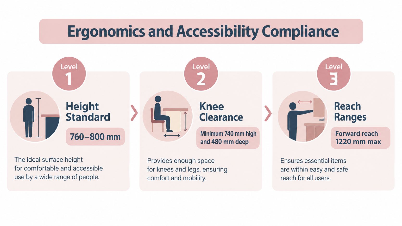
A standard retail counter is usually 900-950mm high for standing service, with an accessible lowered section recommended at 760-800mm to support wheelchair users and reduce service friction. The strongest modern layouts combine that standing work surface with a lower customer-facing zone rather than relying on one fixed-height counter.
You may be planning a refit around a familiar problem. The existing counter takes up valuable floor space, the card reader sits awkwardly behind a pile of paperwork, and customers queue across the entrance while staff reach over displays to complete a sale. Reducing the counter may seem like the obvious answer, but a smaller footprint doesn't automatically create a better shop.
A retail store counter now has to perform several jobs at once. It must support payment, advice, age checks, order collection, product presentation, security and accessible service, while helping customers move naturally through the shop. The right design removes unnecessary hardware without removing the human interactions that make a specialist or service-led store worth visiting.
The Evolving Role of the Retail Counter
The staffed counter used to be the centre of nearly every shop. Customers waited for an assistant to retrieve goods, calculate the price and take payment. Self-service changed that relationship decisively. In Britain, the Board of Trade estimated around 9,500 self-service shops by 1961, including about 1,000 supermarkets, and sales in self-service stores were typically three times higher than in counter-service shops by that year, according to historical research into British retailing.
That history explains why many retailers want to make the counter smaller. It doesn't prove that the counter has become irrelevant. By June 2025, retail sales in Great Britain totalled £9.0 billion per week across shops, supermarkets, petrol stations and online channels, as reported in the House of Commons Library retail sales briefing. Physical retail still handles a substantial volume of national spending, and the counter remains the point where browsing becomes a completed transaction or a more valuable service conversation.

Smaller footprint, higher responsibility
The useful question isn't whether to remove the counter. It's which tasks deserve counter space.
A fashion shop may need a compact payment point, room for returns and a clear surface for folding or checking garments. A convenience store may need age verification, tobacco security, parcel collection and fast payment. A specialist retailer may need a broad consultation surface because staff explain products, compare options or prepare an order in front of the customer.
Practical rule: Remove equipment before removing service capacity. A redundant cash drawer can disappear. A properly positioned accessible service point shouldn't.
The counter's value increasingly comes from what happens around the transaction. Staff can answer a product question, resolve an unusual return, verify an age-restricted purchase or direct a customer towards a complementary item. That makes the counter a service and conversion point, not merely a box containing a till.
The surrounding fixtures matter just as much. A counter needs to work with the display units and storage that form the rest of the shop, rather than becoming an isolated workstation. Retailers assessing furniture for retail stores should map payment, service, storage and merchandising functions before choosing a footprint.
Understanding Counter Dimensions and Types
Counter width is visible, but height and depth determine whether the unit works. A long counter can still feel cramped if the card terminal, receipt printer and staff monitor occupy the only usable area. Conversely, a shorter unit can handle a busy transaction flow when equipment is recessed, cables are managed and the customer side stays clear.
For UK retail, the main standing service surface typically sits at 900-950mm, while common counter modules are built around 900mm high and 600mm deep dimensions, as outlined in this UK retail counter specification guide. Treat those figures as a starting point, not an automatic answer. Your staff posture, POS equipment and customer approach will decide whether the specification is suitable.
Match the form to the job
| Counter type | Where it works | Main trade-off |
|---|---|---|
| Straight counter | Compact shops and simple payment points | Efficient to build, but offers less separation between service and storage |
| L-shaped counter | Retailers combining checkout, advice and packing | Creates useful work zones, but can obstruct sightlines if oversized |
| Low-profile island | Fashion, lifestyle and speciality retail | Keeps the floor visually open, but offers less concealed storage |
| High-service desk | Trade, repair, collection and consultation environments | Supports paperwork and equipment, but can feel imposing to customers |
Depth needs careful planning. A deeper top may provide room for a monitor, printer, cash drawer and stock storage, but it also increases the reach across the customer side. That can make payment feel awkward and create a barrier for seated customers. A shallow counter with wall-mounted or under-counter equipment often gives staff less storage, but creates a calmer, more reachable transaction surface.
Width should follow the number of tasks, not the available wall. If one person takes payment while another wraps products, allow separate working zones. If the same employee does everything, a shorter run may improve movement and reduce duplicated equipment. Use modular display units for retail to extend merchandising nearby rather than making the checkout itself carry every product and storage function.
Ergonomics and Accessibility Compliance
An accessible counter isn't a token shelf attached to the end of a standard run. It needs enough clear floor space for a customer to approach front-on, position comfortably and use the payment equipment without stretching around a raised worktop.
UK accessibility guidance commonly recommends at least one lowered section at 750-800mm from floor level, with a clear knee recess of at least 700mm, as set out in this retail accessibility guidance. The lowered area should be usable, not blocked by a pedestal, waste bin, display stand or fixed screen.
Compare the counter surface, not just the height
Material choices affect how comfortable and dependable the accessible zone feels.
- Laminate gives a practical, repairable finish for high-use shops. Choose a smooth, sealed edge because chipped corners and sharp transitions create avoidable contact points.
- Solid surface allows cleaner joins and shaped edges. It's suited to a prominent service desk where the lowered section needs to look like part of the design rather than an afterthought.
- Glass can keep a counter visually light, but reflections, fingerprints and exposed edges demand disciplined cleaning and careful detailing.
- Timber or veneered finishes add warmth, though the surface needs protection around card readers, bagging areas and frequent contact points.
The most effective arrangement is usually a split-level counter. Staff retain a comfortable standing worktop, while customers receive a lower, clear service area with the card reader positioned where both seated and standing users can reach it. Don't place the terminal at the back of a deep counter and expect the customer to lean forward.
A lowered section also helps staff. It can provide a natural signing, bagging or product-checking position, reducing the need to lift items across a tall barrier. Keep the knee recess open, and check the approach with the surrounding queue rails, dump bins and display plinths before final installation.
Selecting the Right Materials and Finishes
Start with the abuse the counter will receive, then choose the finish. A convenience shop with constant contact, cleaning and hurried transactions needs a surface that tolerates scuffs and can be wiped without special treatment. A boutique may accept more careful maintenance if the counter contributes strongly to the brand experience.
Build the specification from the outside in
Choose the customer-facing finish first, then resolve the working layers behind it.
- Set the visual character. A pale laminate reflects light in a compact shop. Dark timber or stone-effect finishes create weight and distinction, but show dust and fingerprints more readily.
- Protect the contact zones. Use durable edging around corners and the front lip. The area beside the card terminal and bagging position deserves particular attention because hands, products and cleaning cloths repeatedly meet there.
- Separate appearance from structure. A decorative front panel doesn't need to carry the entire counter. A sturdy carcass, replaceable worktop and removable service panels make future repairs less disruptive.
- Plan cleaning access. Avoid narrow ledges around the POS hardware. Dust traps behind a screen or beneath a raised shelf quickly make an otherwise attractive installation look neglected.
Stone can deliver a substantial, premium appearance, but weight, fabrication, joins and replacement costs need to be considered before installation. For a useful overview of colour and pattern decisions, see this granite guide from Varun Marbles. It can help narrow the aesthetic direction, even if the final retail specification uses a lighter or more economical material.
The counter front also influences merchandising. A plain, durable face may be preferable where the unit sits beside a busy aisle, while a recessed panel can accommodate signage without projecting into the customer route. Use MDF shelving board for nearby display construction only when its finish and edge protection suit the traffic level. Don't use a delicate counter finish to compensate for poor circulation or insufficient storage.
Integrating POS Hardware and Security
A modern retail store counter should be designed around the actual POS hardware, not fitted around a generic hole in the worktop. Start with the terminal, receipt printer, scanner, cash drawer and staff screen you will use. Mark their footprints on the proposed surface, then test the transaction from both sides before cutting panels or routing cables.
Contactless payments account for 66% of all POS transactions in the UK, according to UK POS terminal market analysis. That supports a slimmer setup with fewer cash-handling components, but it doesn't mean every shop should remove cash capability. Customers may still need refunds, cash payment, gift-card processing or assisted service, so the hardware plan should reflect the actual customer mix.
Keep the transaction visible
Place the card reader near the customer edge, angled for comfortable use and visible to staff. A terminal hidden behind a monitor slows every interaction and encourages customers to reach across merchandise. Keep receipt output close enough that staff don't turn away, but don't allow paper rolls, cables or a printer housing to occupy the accessible service surface.
Cable management deserves the same attention as the countertop finish. Route power and data through service voids, leave access for replacement and avoid loose leads around the customer's knees. Security tethers, locked drawers and removable equipment panels should be built into the joinery rather than attached as conspicuous afterthoughts.
A retailer comparing modern POS for SME retailers should also assess screen height, scanning position and staff movement. A fast terminal won't solve a poor counter layout if employees must twist repeatedly to reach the scanner or bend under the worktop for every paper roll.
CCTV monitors should cover the till and approach without dominating the customer's eyeline. Electronic article surveillance equipment belongs where it protects the exit path while leaving the payment zone calm. An integrated display system can help coordinate product presentation and hardware, provided the display doesn't reduce reach, visibility or queue capacity.
Strategic Placement and Traffic Flow
A counter placed across the entrance can make a small shop feel guarded before a customer has seen the merchandise. Move it too far into the rear corner and staff lose sight of the door, the queue blocks the main aisle, and customers have no obvious place to complete a return or ask for help.
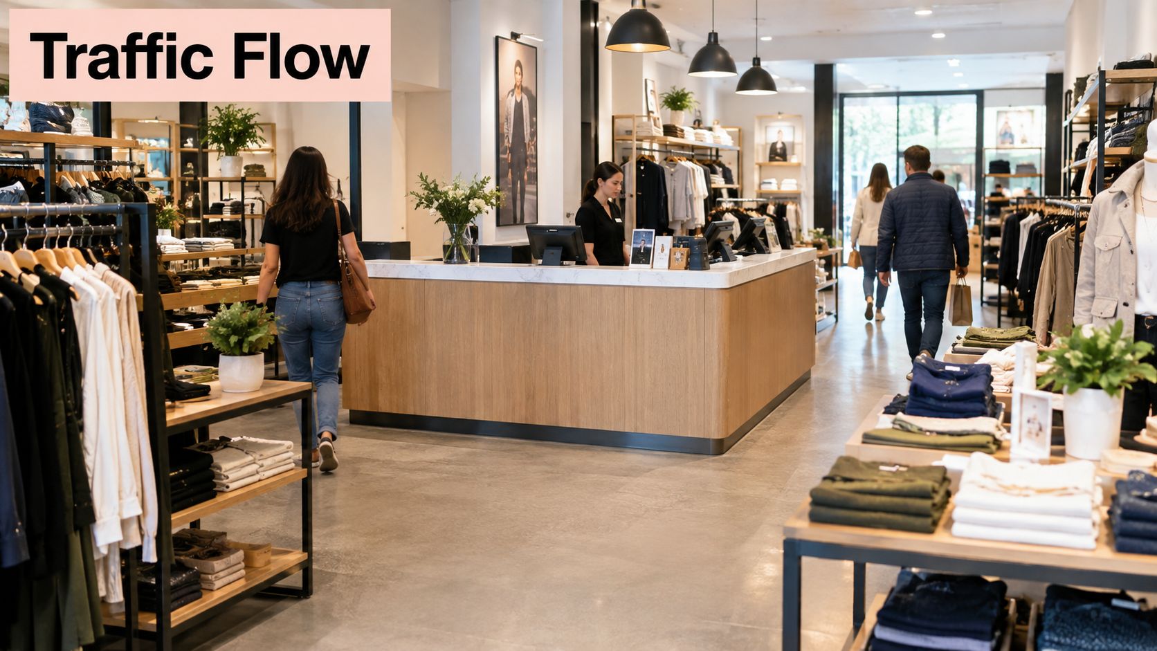
A better arrangement gives the counter a defined position without turning it into a wall. In a clothing shop, a compact checkout along one side can face the entrance while garment rails guide customers around the perimeter. A dump bin near, but not directly in, the queue can occupy a dead corner and provide a low-level browsing point. Keep the approach to the counter visually open so customers can identify where to pay without interrupting the browsing loop.
Test the route with real objects
Mark the proposed counter with tape, then place representative rails, baskets, dump bins and queue barriers around it. Walk the route carrying a shopping bag, approach from the accessible side and stand where a second customer would wait. This simple test often exposes a projecting corner or a queue position that a plan drawing hides.
A counter should define a zone, not defend a territory.
Staff sightlines matter as much as customer movement. From the service position, employees should be able to see the entrance, the payment approach and the most valuable product areas without repeatedly leaving the counter. That doesn't require a completely open plan. Low storage, transparent panels and carefully aligned rails can separate functions while preserving supervision.
A counter also needs a recovery route. Staff should be able to leave the workstation to replenish a display or assist a customer without crossing the queue. Keep stock storage close enough to reduce wasted movement, but don't fill the rear of the desk with supplies that turn a service point into a permanent obstruction.
The following video can help retailers assess how checkout placement relates to the wider shop environment.
Maximizing Impulse Sales and Merchandising
The counter can earn its floor space after the payment equipment has become smaller. UK-oriented research states that British shoppers spend over £3 billion on impulse buys every month, with counter areas remaining important for compliant impulse lines, as discussed in this retail range and display guidance.
That doesn't justify covering the counter with random stock. A crowded surface hides the terminal, slows staff and makes the customer feel trapped in a sales display. The strongest counter merchandising is selective, easy to understand and positioned where a waiting customer can see it without reaching through the transaction zone.
Design the last metre carefully
Use the counter for small, relevant additions rather than slow-moving clearance stock. In convenience retail, that may mean compliant confectionery or a seasonal add-on. In fashion, it could be a compact care product, gift packaging or an accessory that relates directly to the garment being purchased. In a specialist shop, the item should solve a minor problem the customer has already encountered.
Keep the display low enough to preserve staff visibility and avoid placing products where customers must ask the cashier to move them. A single clear message usually works better than several competing offers. Refresh the selection when the season, product range or customer mission changes, and remove anything that creates questions the cashier can't answer quickly.
The counter can also reinforce personalisation. Retailers exploring modern shopping with Quote My Wall will recognise the value of relevant, identity-led recommendations rather than generic clutter. A carefully selected add-on should feel like a useful final suggestion, not an obstacle between the customer and the exit.
Use nearby rails, dump bins and countertop displays as supporting actors. The counter should complete the merchandising story, not carry the whole range. These principles sit alongside broader visual merchandising guidelines, especially when the checkout shares space with product presentation.
A well-designed retail store counter earns its place in three ways. It supports efficient payment, provides inclusive human service and presents a small number of relevant products at the moment of decision. Shrinking the hardware footprint is sensible. Shrinking the counter's purpose is not.
Display Guru supplies retail display equipment including countertop displays, garment rails, dump bins and counter-related display solutions for shops, tailoring environments and visual merchandising projects. Review the available options at Display Guru, then plan your counter, queue route and nearby product displays as one coordinated customer journey.